Pentagram Marks
Posted by David Bushell
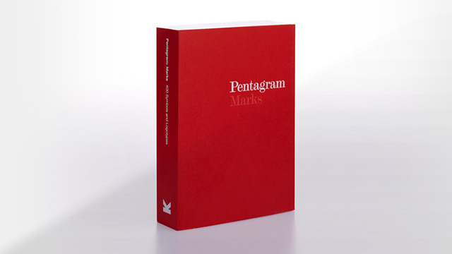
Pentagram Marks arrived in the post this week!
The book is delightfully smallish in stature at an estimated 7.5 x 6 inches and the 400 page depth adds enough weight that it feels important in your hand. The cover is double folded card with a matt finish in red. I'm not going to guess a Pantone but from an artistic point of view I can see hints of blue in there. Not to get too hung up on the red but it's obviously been carefully chosen.
The title is set in Pentagram's logo font which I believe is AT Modern Twenty after a few googles. The word "Marks" is printed in the slightly-blueish-red tinted slightly lighter and also subtlety debossed, which adds a bit of class.
The spine is perfectly minimalist, perfect bound, sans-serif, even the publishes logo looks good. The back cover is the pure red paper stock with a small white barcode sticker in the bottom right corner. This is also a nice touch.
With the exception of the single page introduction the 400 pages consist of a logo centre stage, and bottom right: organisation (bold), year [of design], description of organisation. The layout is simple and does the job. It's by no means a "classic" but it's not over-designed either. Simplicity in design is hard to master. There are no page numbers, any questionable necessity would not justify their overshadowing presence on the page. I can imagine hours of debate over the smallest layout decision. Either that, or knowing those crafty Pentagram partners they probably knocked it up in 2 hours (show offs!).
There are a couple of other interesting things to note. The logos are ordered alphabetically ascending by organisation name. I would have initially expected chronological order, but the more I think about it I'm beginning to agree with this choice. Logos should be timeless so suggesting "old" and "new" is unimportant. And now I realise exactly why this book doesn't need page numbers. You're only ever going to be referencing a particular logo from its name.
Another point of note is the lack of a "designer" attribute. We are therefore forced to see Pentagram as a single entity, and not a collective of ever changing partners.
The logos are presented in black and white:
Isolating them in black and white helps us appreciate these marks as unique formal solutions, and highlights the contrasts and occasional similarities among them.
To suggest that all 400 logos are classics of design would be rather silly. Some of the logos are downright awful. But then you flick past the V&A logo you understand why Pentagram has published their own logo book. There are a few pleasant touches, such as Puffin Books and Penguin Books facing each other on facing pages. No sloppy editing here.
I should note this is a review of the mass print paperback version. The limited 1000 print edition is at least twice as lovely. Check out the Logo Design Love - Pentagram Marks blog post to see it in full-colour photo glory.
You can buy Pentagram Marks on Amazon.